Lars Shaw
Where creativity meets ingenuity
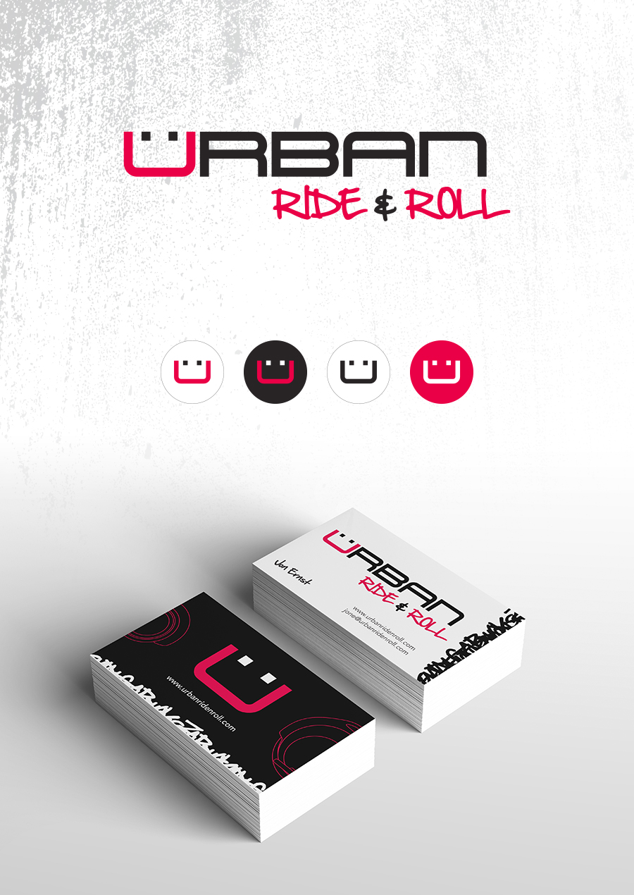
Urban Ride & Roll
- LOCATION:
Sant Clara, CA
- CLIENT:
URBAN RIDE & ROLL
When I started working with Urban Ride & Roll, the company was just starting out. I joined a team of individuals that wanted to become a part of the hover board craze.
After a few weeks of brain storming and tossing around ideas we decided that the official name of the company would be Urban Ride & Roll.
Our name was meant to appeal to everyone. It did not matter where you hailed from. Be it a dense populated city or a small rural town, you could ride around in style with a smile on your face. From this idea the logo was developed incorporating a smiley face into logotype.
As important as it was to let perspective buyers know our hover boards were the right choice in recreation vehicles, it was just as important to distinguish ourselves from our competitors. In order to do this, Urban Ride & Roll adopted a look and feel that was rough around the edges. This edgy feel is evident in the gritty hand written typeface used for “Ride & Roll,” which offsets the solid, clean-cut font used for “Urban.”