Lars Shaw
Where creativity meets ingenuity
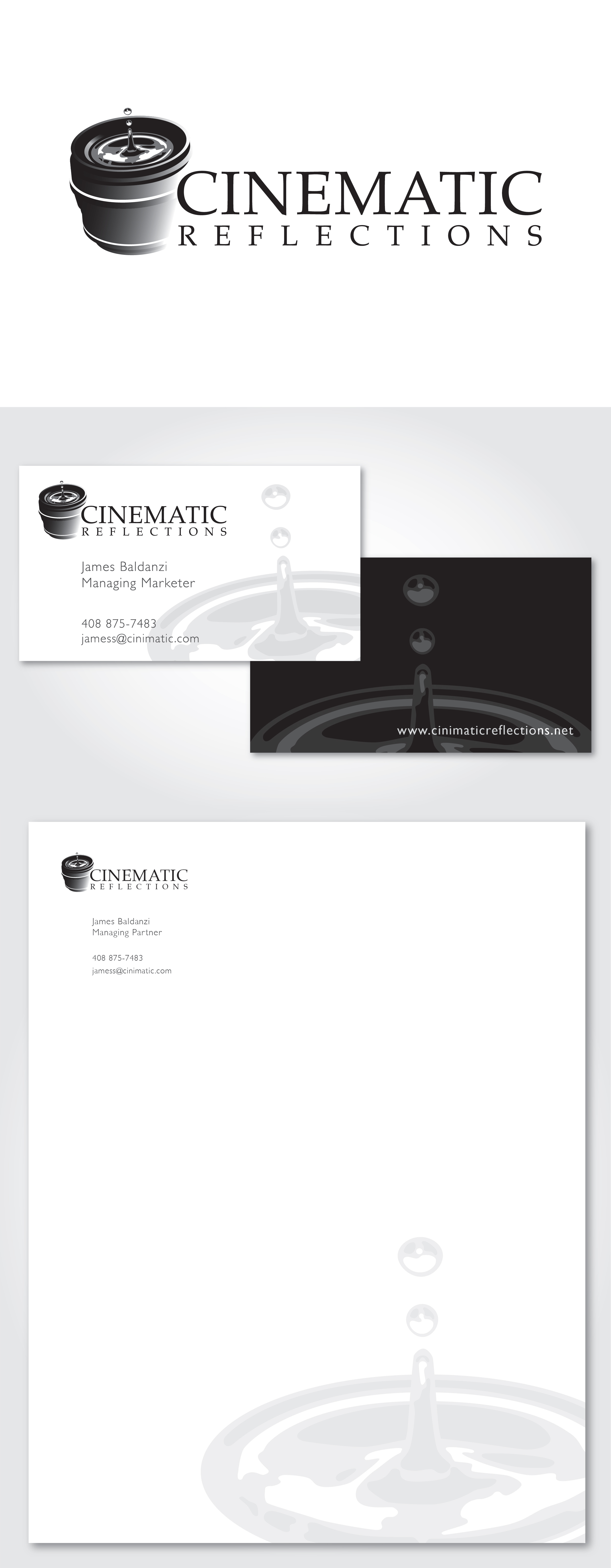
Cinematic Reflections
- LOCATION:
Santa Clara, CA
- CLIENT:
James Baldanzi
This is one of my earliest professional logos I designed for friend. He works in television now, but when he started out, he focused on videography and film production. As with any logo he had a few prerequisites that needed to be included. He wanted an elegant font for the logotype and the logo mark needed to integrate water and a camera lens.
All of the requirements for the logo were clear and straightforward. After a few concepts and revisions it became clear that the water part of the logo needed to look like real water and not a graphical representation. My challenge from this point on was how to create realistic looking water with vector graphics and not make it overly complicated.
I can’t say it was an easy road, but I can and will say it was a rewarding end. After many unsuccessful attempts at making realistic looking water with vector graphics I arrived at the logo you see today.